What I Learned
The importance of simplicity and clarity in content discovery experiences.
What I Improved
User research, information architecture, and visual hierarchy
Next Time
I would conduct more usability tests earlier in the process.
Reflections
After

Before
Key Pain Points

Unclear Value Proposition in the Hero Section
Users don’t immediately understand what Pixquid is or what makes it different. This creates confusion in the first few seconds, increasing bounce risk and reducing conversion into sign-ups.
Limited Entry Points to Conversion
There is only one prominent “Join Now for Free” CTA, which may limit conversion opportunities for users who need more context or time before committing. Multiple, strategically placed CTAs could better capture intent at different stages of the journey.
Low Visibility and Reachability of Key Actions
The “Show All” button is placed in a hard-to-see and hard-to-reach location, making it easy for users to miss or ignore. As a result, users may assume the feature doesn’t exist or isn’t available, limiting deeper content exploration.
Interaction Patterns Don’t Align with User Expectations
While key actions (like favoriting) function correctly, their placement conflicts with common user intuition (e.g., users expect the action on the right side). This creates small moments of hesitation and misclicks, adding friction to otherwise simple interactions.
Inefficient Navigation for Long Scrolling Pages
The absence of a quick “back to top” option forces users into excessive scrolling, making exploration feel tedious—especially on mobile.
Lack of Pricing Transparency in Content Browsing
Users are unable to easily distinguish between free and rented movies while browsing, creating uncertainty around cost. This ambiguity slows decision-making, increases hesitation to engage with content, and can lead to frustration if users encounter unexpected paywalls.
The Solution
Added “Join Now” and “Why Pixquid” to Top Navigation
Increases visibility of key actions and information at all times. “Join Now” creates more consistent entry points for conversion, while “Why Pixquid” helps clarify the platform’s value proposition for new users who need context before committing.
Changed Hero Message to “Release . Stream . Connect . Thrive”
Communicates a clearer and more compelling value proposition by highlighting both creator and viewer benefits. The language emphasizes action and ecosystem, helping users quickly understand what the platform enables.
After

Before

The Solution COntinued…
Moved “Free,” “All Movies,” and “My Collection” to the Center Near Search and Above Content
Places primary browsing controls closer to where users are actively exploring content, improving discoverability and reducing cognitive effort. This aligns navigation with user intent at the moment of interaction.
Replaced Previous “Show All” Label with “Back to Top” Button
Re-purposes underutilized space into a more functional navigation aid. This supports long-scroll usability by allowing users to quickly reset their position without excessive scrolling.
Added Visual Indicator to Differentiate Free vs. Rented Movies
Removes ambiguity around pricing by giving users immediate clarity at the point of browsing. This reduces hesitation, supports faster decision-making, and improves trust by setting clear expectations before users engage with content.
Added “Show More” Button Under Each Movie Section
Improves accessibility and visibility of expanded content options by placing the action directly within the user’s browsing flow. This reduces friction and encourages deeper exploration.
Moved Favorites Icon to the Right Side
Aligns with common user expectations and interaction patterns, reducing hesitation and improving efficiency when performing quick actions like favoriting content.
A Little Extra
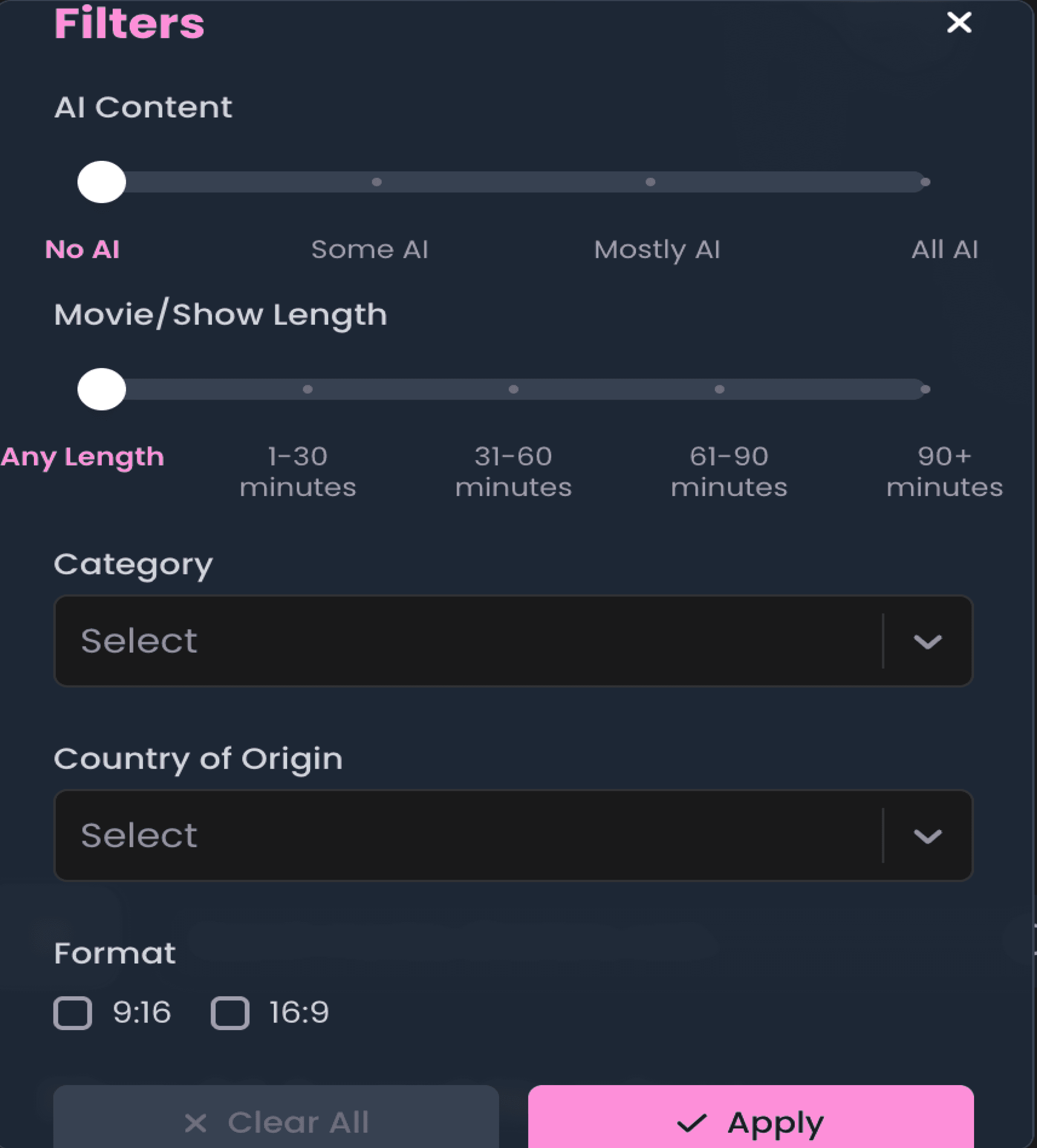
Updated Filter: Changed “Category” to “Genre” and Prioritized It Above AI Content Filter
Removes ambiguity around pricing by giving users immediate clarity at the point of browsing. This reduces hesitation, supports faster decision-making, and improves trust by setting clear expectations before users engage with content.

Wow, I barely saw that
Oops, I clicked the right side out of habit
Before

After


The Problem
“It’s not clear what makes Pixquid special.”
-- Kameron Parker

Research & Discovery
Research Methods
Interviews
3 Participants
Competitive Analysis
Netflix, Peacock, Hulu, Tubi
Usability Tests
2 Tests

What does this even mean??
More empty space??
Empty space, missing opportunity for a CTA

Is this one free??
Impact & Outcomes
Improved Discoverability
Users can find relevant films faster
Reduced Cognitive Load
Simper navigation improves experience.
Stronger Onboarding
Clear messaging helps users get started easily.


Pixquid
Landing Page Re-design
A re-design of the Pixquid landing page to improve discovery and increase user engagement.
Role
UX/UI Designer
2 Weeks
Duration
Solo
Team
Figma
Tools
Project Overview
Goal
Give clarity on what Pixquid is from the first click onto the platform as well as Increase user engagement by implementing design changes to improve the User Experience
Users
Independent filmmakers, Cinaphiles, Distributors
My Responsibilities
Research, Wireframes, UI Design, Prototyping, Usability Testing, Presentation
“It’s not clear what makes Pixquid special.”
-- Kameron Parker
The Problem
Key Pain Points
Unclear Value Proposition in the Hero Section
Users don’t immediately understand what Pixquid is or what makes it different. This creates confusion in the first few seconds, increasing bounce risk and reducing conversion into sign-ups.
Limited Entry Points to Conversion
There is only one prominent “Join Now for Free” CTA, which may limit conversion opportunities for users who need more context or time before committing. Multiple, strategically placed CTAs could better capture intent at different stages of the journey.
Low Visibility and Reachability of Key Actions
The “Show All” button is placed in a hard-to-see and hard-to-reach location, making it easy for users to miss or ignore. As a result, users may assume the feature doesn’t exist or isn’t available, limiting deeper content exploration.
Interaction Patterns Don’t Align with User Expectations
While key actions (like favoriting) function correctly, their placement conflicts with common user intuition (e.g., users expect the action on the right side). This creates small moments of hesitation and misclicks, adding friction to otherwise simple interactions.
Inefficient Navigation for Long Scrolling Pages
The absence of a quick “back to top” option forces users into excessive scrolling, making exploration feel tedious—especially on mobile.
Lack of Pricing Transparency in Content Browsing
Users are unable to easily distinguish between free and rented movies while browsing, creating uncertainty around cost. This ambiguity slows decision-making, increases hesitation to engage with content, and can lead to frustration if users encounter unexpected paywalls.
Lack of Pricing Transparency in Content Browsing
Added “Join Now” and “Why Pixquid” to Top Navigation
Users are unable to easily distinguish between free and rented movies while browsing, creating uncertainty around cost. This ambiguity slows decision-making, increases hesitation to engage with content, and can lead to frustration if users encounter unexpected paywalls.
Increases visibility of key actions and information at all times. “Join Now” creates more consistent entry points for conversion, while “Why Pixquid” helps clarify the platform’s value proposition for new users who need context before committing.
Added “Join Now” and “Why Pixquid” to Top Navigation
Changed Hero Message to “Release . Stream . Connect . Thrive”
Increases visibility of key actions and information at all times. “Join Now” creates more consistent entry points for conversion, while “Why Pixquid” helps clarify the platform’s value proposition for new users who need context before committing.
Communicates a clearer and more compelling value proposition by highlighting both creator and viewer benefits. The language emphasizes action and ecosystem, helping users quickly understand what the platform enables.
The Solution
Moved “Free,” “All Movies,” and “My Collection” to the Center Near Search and Above Content
Places primary browsing controls closer to where users are actively exploring content, improving discoverability and reducing cognitive effort. This aligns navigation with user intent at the moment of interaction.
Replaced Previous “Show All” Label with “Back to Top” Button
Re-purposes underutilized space into a more functional navigation aid. This supports long-scroll usability by allowing users to quickly reset their position without excessive scrolling.
Added Visual Indicator to Differentiate Free vs. Rented Movies
Removes ambiguity around pricing by giving users immediate clarity at the point of browsing. This reduces hesitation, supports faster decision-making, and improves trust by setting clear expectations before users engage with content.
Added “Show More” Button Under Each Movie Section
Improves accessibility and visibility of expanded content options by placing the action directly within the user’s browsing flow. This reduces friction and encourages deeper exploration.
Moved Favorites Icon to the Right Side
Aligns with common user expectations and interaction patterns, reducing hesitation and improving efficiency when performing quick actions like favoriting content.
The Solution
continued…
Updated Filter: Changed “Category” to “Genre” and Prioritized It Above AI Content Filter
Removes ambiguity around pricing by giving users immediate clarity at the point of browsing. This reduces hesitation, supports faster decision-making, and improves trust by setting clear expectations before users engage with content.
A little extra
high fidelity prototype
Oops, I clicked the right side out of habit
Wow, I barely saw that
Wow, I barely saw that
Oops, I clicked the right side out of habit
Wow, I barely saw that
Wow, I barely saw that
Research & Discovery
Research Methods
Interviews
3 Participants
Competitive Analysis
Netflix, Peacock, Hulu, Tubi
Usability Tests
2 Tests
impact & outcomes
Improved Discoverability
Users can find relevant films faster
Reduced Cognitive Load
Simper navigation improves experience.
Stronger Onboarding
Clear messaging helps users get started easily.
Before
After
Before
After
Before
After
Empty space, missing opportunity for a CTA
What does this even mean??
More empty space??
Interviews
3 Participants
Competitive Analysis
Netflix, Peacock, Hulu, Tubi
Usability Tests
2 Tests
Interviews
3 Participants
Competitive Analysis
Netflix, Peacock, Hulu, Tubi
Usability Tests
2 Tests
“It’s not clear what makes Pixquid special.”
-- Kameron Parker
The Problem
The Problem
Research & Discovery
Research Methods
Interviews
3 Participants
Competitive Analysis
Netflix, Peacock, Hulu, Tubi
Usability Tests
2 Tests
Key Pain Points
Unclear Value Proposition in the Hero Section
Users don’t immediately understand what Pixquid is or what makes it different. This creates confusion in the first few seconds, increasing bounce risk and reducing conversion into sign-ups.
Unclear Value Proposition in the Hero Section
Limited Entry Points to Conversion
Users don’t immediately understand what Pixquid is or what makes it different. This creates confusion in the first few seconds, increasing bounce risk and reducing conversion into sign-ups.
There is only one prominent “Join Now for Free” CTA, which may limit conversion opportunities for users who need more context or time before committing. Multiple, strategically placed CTAs could better capture intent at different stages of the journey.
Limited Entry Points to Conversion
Low Visibility and Reachability of Key Actions
There is only one prominent “Join Now for Free” CTA, which may limit conversion opportunities for users who need more context or time before committing. Multiple, strategically placed CTAs could better capture intent at different stages of the journey.
The “Show All” button is placed in a hard-to-see and hard-to-reach location, making it easy for users to miss or ignore. As a result, users may assume the feature doesn’t exist or isn’t available, limiting deeper content exploration.
Low Visibility and Reachability of Key Actions
Interaction Patterns Don’t Align with User Expectations
The “Show All” button is placed in a hard-to-see and hard-to-reach location, making it easy for users to miss or ignore. As a result, users may assume the feature doesn’t exist or isn’t available, limiting deeper content exploration.
While key actions (like favoriting) function correctly, their placement conflicts with common user intuition (e.g., users expect the action on the right side). This creates small moments of hesitation and misclicks, adding friction to otherwise simple interactions.
What does this even mean??
More empty space??
Empty space, missing opportunity for a CTA
What does this even mean??
More empty space??
Empty space, missing opportunity for a CTA
Oops, I clicked the right side out of habit
Wow, I barely saw that
Oops, I clicked the right side out of habit
Wow, I barely saw that
Interaction Patterns Don’t Align with User Expectations
Inefficient Navigation for Long Scrolling Pages
While key actions (like favoriting) function correctly, their placement conflicts with common user intuition (e.g., users expect the action on the right side). This creates small moments of hesitation and misclicks, adding friction to otherwise simple interactions.
The absence of a quick “back to top” option forces users into excessive scrolling, making exploration feel tedious—especially on mobile.
Inefficient Navigation for Long Scrolling Pages
Lack of Pricing Transparency in Content Browsing
The absence of a quick “back to top” option forces users into excessive scrolling, making exploration feel tedious—especially on mobile.
Users are unable to easily distinguish between free and rented movies while browsing, creating uncertainty around cost. This ambiguity slows decision-making, increases hesitation to engage with content, and can lead to frustration if users encounter unexpected paywalls.
Inefficient Navigation for Long Scrolling Pages
Added “Join Now” and “Why Pixquid” to Top Navigation
The absence of a quick “back to top” option forces users into excessive scrolling, making exploration feel tedious—especially on mobile.
Increases visibility of key actions and information at all times. “Join Now” creates more consistent entry points for conversion, while “Why Pixquid” helps clarify the platform’s value proposition for new users who need context before committing.
Added “Join Now” and “Why Pixquid” to Top Navigation
Changed Hero Message to “Release . Stream . Connect . Thrive”
Increases visibility of key actions and information at all times. “Join Now” creates more consistent entry points for conversion, while “Why Pixquid” helps clarify the platform’s value proposition for new users who need context before committing.
Communicates a clearer and more compelling value proposition by highlighting both creator and viewer benefits. The language emphasizes action and ecosystem, helping users quickly understand what the platform enables.
The Solution
Before
After
Changed Hero Message to “Release . Stream . Connect . Thrive”
Moved “Free,” “All Movies,” and “My Collection” to the Center Near Search and Above Content
Communicates a clearer and more compelling value proposition by highlighting both creator and viewer benefits. The language emphasizes action and ecosystem, helping users quickly understand what the platform enables.
Places primary browsing controls closer to where users are actively exploring content, improving discoverability and reducing cognitive effort. This aligns navigation with user intent at the moment of interaction.
Moved “Free,” “All Movies,” and “My Collection” to the Center Near Search and Above Content
Replaced Previous “Show All” Label with “Back to Top” Button
Places primary browsing controls closer to where users are actively exploring content, improving discoverability and reducing cognitive effort. This aligns navigation with user intent at the moment of interaction.
Re-purposes underutilized space into a more functional navigation aid. This supports long-scroll usability by allowing users to quickly reset their position without excessive scrolling.
Replaced Previous “Show All” Label with “Back to Top” Button
Added Visual Indicator to Differentiate Free vs. Rented Movies
Re-purposes underutilized space into a more functional navigation aid. This supports long-scroll usability by allowing users to quickly reset their position without excessive scrolling.
Removes ambiguity around pricing by giving users immediate clarity at the point of browsing. This reduces hesitation, supports faster decision-making, and improves trust by setting clear expectations before users engage with content.
Added Visual Indicator to Differentiate Free vs. Rented Movies
Added “Show More” Button Under Each Movie Section
Removes ambiguity around pricing by giving users immediate clarity at the point of browsing. This reduces hesitation, supports faster decision-making, and improves trust by setting clear expectations before users engage with content.
Improves accessibility and visibility of expanded content options by placing the action directly within the user’s browsing flow. This reduces friction and encourages deeper exploration.
Added “Show More” Button Under Each Movie Section
Moved Favorites Icon to the Right Side
Improves accessibility and visibility of expanded content options by placing the action directly within the user’s browsing flow. This reduces friction and encourages deeper exploration.
Aligns with common user expectations and interaction patterns, reducing hesitation and improving efficiency when performing quick actions like favoriting content.
The Solution
continued…
The Solution continued…
Before
After
Moved Favorites Icon to the Right Side
Updated Filter: Changed “Category” to “Genre” and Prioritized It Above AI Content Filter
Aligns with common user expectations and interaction patterns, reducing hesitation and improving efficiency when performing quick actions like favoriting content.
Removes ambiguity around pricing by giving users immediate clarity at the point of browsing. This reduces hesitation, supports faster decision-making, and improves trust by setting clear expectations before users engage with content.
A little extra
Before
After
high fidelity prototype
impact & outcomes
Improved Discoverability
Users can find relevant films faster
Reduced Cognitive Load
Simper navigation improves experience.
Stronger Onboarding
Clear messaging helps users get started easily.
Pixquid
Landing Page Re-design
A re-design of the Pixquid landing page to improve discovery and increase user engagement.
Role
UX/UI Designer
Duration
2 Weeks
Team
Solo
Tools
Figma
Project Overview
Goal
Give clarity on what Pixquid is from the first click onto the platform as well as Increase user engagement by implementing design changes to improve the User Experience
Users
Independent filmmakers, Cinaphiles, Distributors
My Responsibilities
Research, Wireframes, UI Design, Prototyping, Usability Testing, Presentation
Reflections
What I Learned
The importance of simplicity and clarity in content discovery experiences.
What I Improved
User research, information architecture, and visual hierarchy
Next Time
I would conduct more usability tests earlier in the process.
Reflections
What I Learned
The importance of simplicity and clarity in content discovery experiences.
What I Improved
User research, information architecture, and visual hierarchy
Next Time
I would conduct more usability tests earlier in the process.